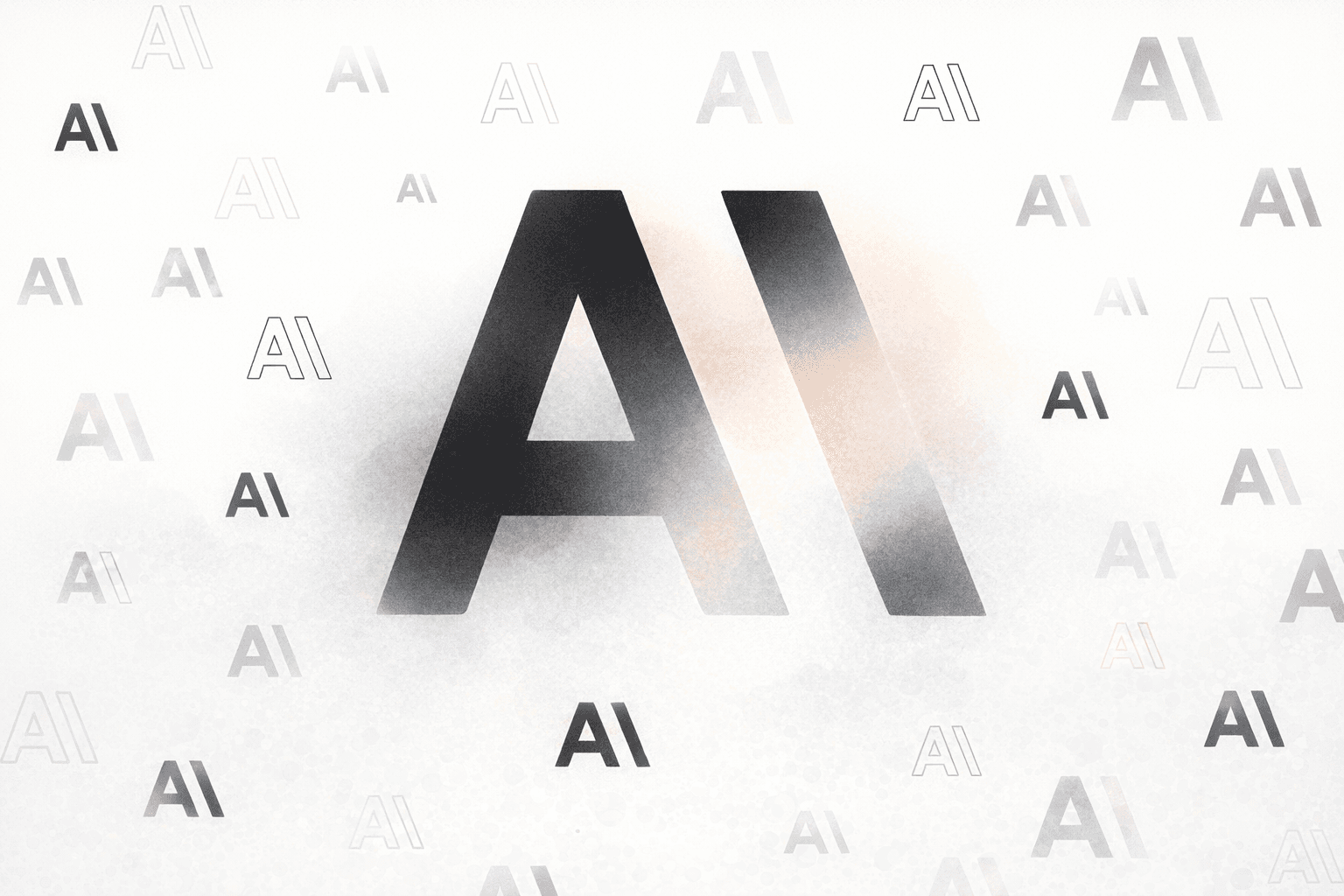
AI companies are quietly retiring the clean sans-serif look that defined a generation of software interfaces and replacing it with serifs. Claude, Perplexity, Runway, and Manus have all moved to serif typefaces in product surfaces and branding, a shift designer Keya Vadgama calls the "serif renaissance." Critics online have a less generous name for it: tasteslop.
The pattern is consistent enough to read as strategy. Anthropic's Claude pairs a serif body with a brown-tinted background that evokes a printed book page. Perplexity has layered serifs into its interface. Runway and Manus have done similar work. Vadgama, writing on Substack, argues the choice is a bid for warmth in a category the public increasingly distrusts.
Serifs carry a specific cultural payload. Times New Roman, commissioned in the 1930s by Britain's Times newspaper, became the default for books, newspapers, and reference works including Encyclopedia Britannica in the pre-World Wide Web era. Sans-serifs like Arial, Calibri, and Helvetica replaced them in the screen-reading era because they rendered more cleanly on early displays. Now the pendulum is swinging back, and AI companies are leading it.
Key facts
- 01Anthropic's Claude, Perplexity, Runway, and Manus have all shifted to serif typefaces in product UX and branding.
- 02Times New Roman, the canonical serif, was commissioned in the 1930s by Britain's Times newspaper.
- 03Designer Keya Vadgama calls the shift a 'serif renaissance' aimed at projecting warmth and human authorship.
- 04Critics on X and elsewhere have labeled the look 'tasteslop' — superficially sophisticated AI-generated design.
- 05The US State Department recently returned to Times New Roman after Marco Rubio called Calibri 'informal.'
Perplexity confirmed the intent directly. Chief communications officer Jesse Dwyer told Wired the company designs for humans, framing the typographic choice as continuous with its product positioning rather than aesthetic accident. Vadgama, who recently did branding work for a since-shuttered AI startup that favored serifs, describes the underlying calculation as a trust play — companies asking how to position themselves so users are not afraid of them.
“Why wouldn't we have human design? Perplexity is for people.”— Jesse Dwyer, Perplexity chief communications officer
The trend has not landed cleanly with the design community. Ali S. Qadeer, chair of graphic design at the Ontario College of Art and Design in Toronto, says serifs carry connotations of scholarship in the broad public, and that Claude in particular is emulating the feeling of reading print, where trust associations run deeper. He reads the entire shift as deliberate softening in response to two decades of sterile tech aesthetics accumulating negative associations.
Designer Yitong Zhang takes a more pragmatic view, calling the transition "cursed" on X but attributing it to labs trying to get models good at design rather than to a coordinated PR project. He likens the result to what blogger Venkatesh Rao termed "premium mediocre" — the finest bottle of wine at Olive Garden. A faux-luxury aesthetic generated by models trained on the outputs of other models, with serifs begetting more serifs.
The State Department arrived at the same typeface from a different direction. The agency recently reverted to Times New Roman after Secretary of State Marco Rubio called Calibri "informal," framing the earlier adoption of the sans-serif as a Biden-era DEI initiative. The convergence is coincidental but telling: institutions reaching for serifs to project authority at the same moment AI companies reach for them to project humanity.
Claude itself, when asked, more or less confirms the read. Prompted about its serif default, the chatbot cited trust, authority, and literary seriousness, but also acknowledged heavy borrowing and herd mentality across the field. It went further: the clean lines, fluid animations, and assured typography communicate that the system knows what it is doing, and the aesthetic, in Claude's own words, actively works against accurate mental models of what AI is.
That is the heart of the critique. Vadgama argues there is something dishonest about using serifs to signal "we're not one of those scary AI companies" when the underlying product is still an AI company. Comic Sans would not change that fact, and neither does Times New Roman. The typeface is a costume, not a clarification.
The counter-argument is that every consumer technology eventually develops a design vocabulary, and the AI cohort is doing exactly that — borrowing from print's authority the same way early web design borrowed from print layout. That AI labs converge on similar choices is not evidence of conspiracy; it is evidence of a maturing category copying what works. The serif move is no more sinister than Stripe's gradient or Apple's rounded corners.
What makes this round different is the gap between the signal and the substance. Stripe's gradient does not claim Stripe is something it is not. A serif on Claude's interface is doing rhetorical work — borrowing the trust accrued by centuries of printed books to underwrite a probabilistic text generator that was running on AWS five minutes ago. Whether users notice or care is a separate question.
The bigger commercial story is that AI labs are now competing on vibe as much as benchmarks. When Claude, Perplexity, Runway, and Manus all converge on the same typographic language, the differentiation moves elsewhere — to model quality, to product depth, to distribution. Design becomes table stakes, and the labs that win will not be the ones with the best serif. They will be the ones whose product justifies whatever font they picked.

Working on something we should cover, or seeing a story we missed? Send leads, documents, or feedback to hello@aichatdaily.com. For sensitive tips, see our secure tips page for Signal and PGP options.
Spotted an error? Email hello@aichatdaily.com with the URL and the issue, or read our full corrections policy.